Updates from Terri on Her Art Journey
|
|
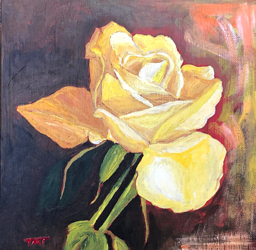 Of the roughly 100 paintings I made during this year, my favorite is this “Single Yellow Rose,” which I painted in acrylics in the spring. I like it for its colors and because it’s probably the most authentically “me” thing I painted all year. The original painting was bought at an art fair on Mother’s Day. But thanks to the print-on-demand services by my art dealer, Fine Art America, I was able to make a framed print which now hangs on my bedroom wall.
Much of the art I made this year, however, I would call “ugly.” By the end of the year, I’d only added 60 pieces of artwork to my inventory on FAA. And, honestly, I believe I would be doing better if I’d painted a little more frequently. At the beginning of the year, I was painting daily, but by the end of summer, I was spending less and less time in the studio. My bad. But rather than beat myself up, let me review the goals I set for myself this year and assess what I actually did well. Among my accomplished goals, after being certified by the Learn To Paint Academy as a Moore Certified Instructor (MCI), I taught my first painting class for absolute beginners at the City Lights Art Gallery in Henderson, NV, this summer. Along with my good friend Sujata, I showed how anyone can learn to paint using a simple method that employs just three brushes, three colors of paint and three easy steps. It was a blast to see how well our students did, and I learned a valuable lesson: I find more joy in TEACHING people how to paint than SELLING art. Indeed, my art sales this year were underwhelming. My goal had been to do at least three commissioned paintings (I did only one), and to earn $500 a month (I achieved that goal only once this year). Alas, if making money was my main goal in making art, I’d be in big trouble! Fortunately, making money is not my main goal, and in one area in particular I did quite well. This year I got increasingly involved in the local art community, volunteering at the Las Vegas Artists Guild, exhibiting at a couple of art festivals in Henderson, and even entering a juried competition. I’ve been blessed to make so many talented “arty” friends this year who have been encouraging and supportive. At the same time, I’ve been working on my own self-development, taking numerous classes and courses from accomplished artists, like Rod Moore, Louise Fletcher, Nicholas Wilton and Joan Iaconetti. I’m learning from the best, building my skills and getting closer to uncovering my unique artistic style and voice. Admittedly, I still have a long way to go on my art journey . . . The three valuable lessons I’ll take away from this year: 1) Stay flexible because disruptions happen and life gets in the way; 2) Don’t get discouraged when all my goals are not met because some accomplishments are not quantifiable; and 3) Stay motivated and keep working on quality rather than quantity. As I set some goals for 2023, I need to keep these lessons in mind.
0 Comments
 This is hard for me to admit, but I must confess that I’ve hit a dry spell in my art journey. Since returning to my Las Vegas studio just about one month ago, I haven’t picked up a paintbrush . . . not even once.
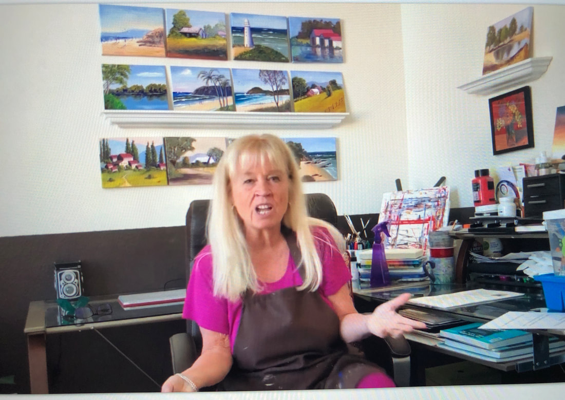
And it’s driving me crazy. In fact, the only time I’ve put on my painter’s apron this past month was to produce this testimonial video for my art instructor and mentor, Rod Moore. If you and I are friends on Facebook, you’ve probably seen this video more than once: https://youtu.be/_Ri5Kz6dHIU Sadly, I’m stuck in a creative rut, and I dearly want to get back on track. In my experience, I’ve found that I do my best work when I pray to God for inspiration and ask His Holy Spirit to co-create with me. Have you ever gone through an artistic or creative dry spell? If so, how did you overcome it? I’d love to hear your strategies for dealing with this problem. I have a feeling it may be somewhat of a common experience for creative people. I’ve heard some so-called experts say, “Just show up!” and the inspiration will follow. Does that really work? Perhaps I need to simply procrastinate less and pray more! What do you suggest? This year I did something a little different for Christmas. I decorated the Xmas tree with some of my original art!
It turns out Fine Art America can reproduce my artwork (including paintings and photographs) as ornaments. Their holiday ornaments are made of ½” solid wood and come in six different shapes: hearts, stars, bells, ovals, trees and stockings. Each ornament includes a string for hanging on your tree and a magnet on the back to stick on your refrigerator after the holiday. And the ornament/magnets are only $10 each, making them the cheapest way to display my original art. For my tree (and refrigerator), I selected the 4” oval shape. The quality of the reproductions was even better than I expected. It’s probably too late to order in time for delivery by this Christmas, but you might consider stocking up now for NEXT Christmas. If you’re interested, check out my store on Fine Art America at www.fineartamerica.com/profiles/7-terri-thompson And I hope you have a blessed Christmas and a happy, healthy New Year! Cheers! 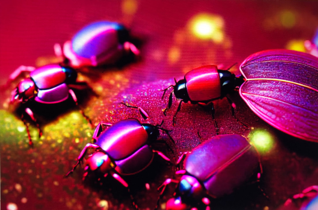 The Pantone Color Institute is the global color authority known for creating the Pantone Matching System, which is used to identify and match colors in industries such as printing, graphic design and fashion. For more than 20 years, it has named a “Color of the Year” every December.
Last week Pantone announced that the color it has selected for 2023 is a vibrant relative of the red family called Viva Magenta. It is described as a “nuanced crimson tone” that balances warm and cool. In announcing its choice, Pantene said, “it is an unconventional shade for an unconventional time.” The hue was inspired by the natural red dye derived from small insects called cochineals (pictured above). In a press release, Pantone stated, “As virtual worlds become a more prominent part of our daily lives, we look to draw inspiration from nature and what is real. Rooted in the primordial, Viva Magenta reconnects us to original matter. Invoking the forces of nature, it galvanizes our spirit, helping us to build our inner strength.” The company went on to describe the color as “audacious, witty and inclusive of all.” Pantene’s “color of the year” is intended to reflect the latest trends in fashion, beauty, technology, design and home décor, and serves as something of a mood ring, with shades chosen to capture the zeitgeist. In years of uncertainty, it has often called for colors that soothe, calm or uplift. This year, amid the ongoing pandemic, Viva Magenta represents reassurance, confidence and connection in a world trying to get back on its feet, according to Laurie Pressman, vice president of the Pantone Color Institute. During a CNN video call, she said, “We are living in quite the unconventional time. The only thing that has become conventional is the unconventionality of it. While there have been so many things that have played into our thinking, so many things that have influenced and impacted what’s taken place and the changes we’ve had to make, there’s no doubt that the overriding influence has been Covid.” I really like how the Institute’s press statement describes Viva Magenta as “brave and fearless, a pulsating color whose exuberance promotes optimism and joy. Powerful and empowering, it is an animated red that encourages experimentation and self-expression without restraint; an electrifying, boundaryless shade.” Boundaryless . . . I like the sound of that! What do you think of this color? |
AuthorTerri Thompson is a journalist-turned-visual artist, who is on an "art journey" and exploring how to tell her stories through her watercolor and acrylic paintings and photographs. Categories |


 RSS Feed